in995-Using-red-poppies-to-pry-open-the-dawn-the-power-of-breaking-through-under-the-Belgian-flag
▼
, Metall und andere Kunsthandwerke")
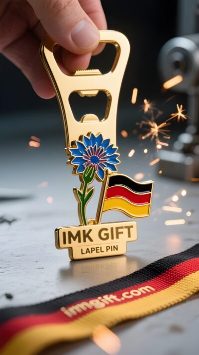
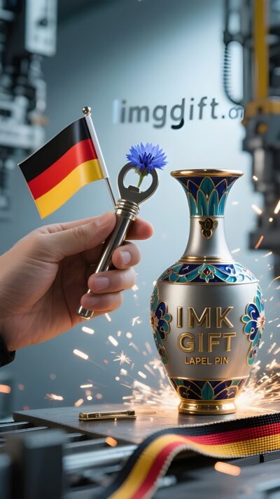
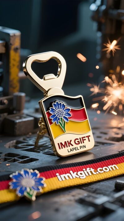
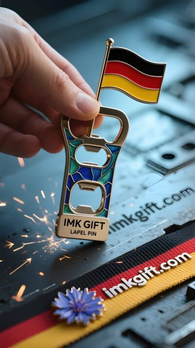
Every November 11, the sea of red poppies on Armistice Day in Belgium always reminds people of the hope that bloomed in the flames of war a hundred years ago. This commemorative symbol watered with blood is now cast into a poppy bottle opener – the metal petals are wrapped with delicate mechanisms, just like the spiritual code of this country: using flexibility to fight against rigidity, and using wisdom to pry open the dilemma. The black, yellow and red vertical stripes of the Belgian flag are like three rays of light that pry open the darkness. The black base carries the weight of the Industrial Revolution, the golden stripes shine with the sharpness of diamond cutting, and the bright red ribbon is soaked with the memory of the Flanders battlefield. Just as the poppy bottle opener needs to find the force point of the bottle cap, this country sandwiched between the great powers knows how to survive: using social cooperation like precision gears to pry international influence far beyond its size in the heart of the European Union. The spiral pattern of the poppy bottle opener hides a mystery, and a slight rotation can disintegrate the closed system. Designers in Brussels have injected this “boundary-breaking thinking” into the city’s genes: from the curvilinear revolution of the Art Nouveau movement to the policy innovation of the EU headquarters, Belgians have always proved that real strength does not lie in volume, but in the cleverness of using a little force to achieve a great result. When the metal petals bite the bottle cap, we see not only a breakthrough in physical structure, but also the survival wisdom of a nation tempered in the cracks of history: wrapping the edge with flexibility and opening a new situation with ingenuity. This may be the answer Belgium offers to the world – every dilemma hides a dawn waiting to be pried open.
, Metall und andere Kunsthandwerke")
Cada 11 de noviembre, el mar de amapolas rojas en el Día del Armisticio en Bélgica siempre recuerda a la gente la esperanza que floreció en la guerra de hace cien años. Este símbolo conmemorativo, regado con sangre, ahora ha sido fundido en un abridor de botellas de amapola: los pétalos de metal están envueltos con un mecanismo delicado, como el código espiritual de este país: usar la flexibilidad para contrarrestar la dureza y usar la sabiduría para abrir situaciones difíciles. Las franjas verticales negras, amarillas y rojas de la bandera belga son como tres rayos de luz que abren la oscuridad. La base negra lleva el peso de la Revolución Industrial, las rayas doradas brillan con la nitidez del corte de diamante y la cinta roja brillante está imbuida del recuerdo del campo de batalla de Flandes. Del mismo modo que un sacacorchos necesita encontrar el punto de fuerza adecuado para el tapón de una botella, este país situado entre las grandes potencias sabe cómo sobrevivir: usando la colaboración social como si fuera un engranaje preciso para aprovechar una influencia internacional mucho más allá de su tamaño en el seno de la Unión Europea. El patrón en espiral del sacacorchos Poppy esconde un secreto: una suave rotación puede desintegrar el sistema cerrado. Los diseñadores de Bruselas han inyectado este “pensamiento rompedor” en los genes de la ciudad: desde la revolución curvilínea del movimiento Art Nouveau hasta las innovaciones políticas en la sede de la UE, los belgas siempre han demostrado que la verdadera fuerza no reside en el tamaño, sino en la capacidad de usar un poco de fuerza para lograr un gran resultado. Cuando los pétalos de metal muerden la tapa de la botella, lo que vemos no es sólo un avance en la estructura física, sino también la sabiduría de supervivencia forjada por una nación en las grietas de la historia: envolviendo el borde con flexibilidad y abriendo una nueva situación con ingenio. Esta puede ser la respuesta que Bélgica ofrece al mundo: detrás de cada dilema hay un amanecer que espera ser revelado.
, Metall und andere Kunsthandwerke")
每年11月11日,比利时停战日的红罂粟花海总会让人想起百年前战火中绽放的希望。这个用鲜血浇灌的纪念符号,如今被铸成虞美人开瓶器——金属花瓣包裹着精巧机关,如同这个国家的精神密码:以柔韧对抗刚硬,以智慧撬动困局。
比利时国旗的黑、黄、红三色竖纹,恰似撬开黑暗的三道光芒。黑色基底承载着工业革命的厚重,金黄条纹闪耀着钻石切割的锋芒,鲜红缎带则浸透着佛兰德斯战场的记忆。正如虞美人开瓶器需要找准瓶盖的受力点,这个夹在列强之间的国家深谙生存之道:用精密齿轮般的社会协作,在欧盟心脏位置撬动远超体量的国际影响力。
虞美人开瓶器的螺旋纹路暗藏玄机,轻轻旋转便能瓦解封闭系统。布鲁塞尔的设计师们将这种”破界思维”注入城市基因:从新艺术运动的曲线革命,到欧盟总部的政策创新,比利时人始终在证明——真正的力量不在于体积,而在于四两拨千斤的巧劲。当金属花瓣咬住瓶盖的瞬间,我们看到的不仅是物理结构的突破,更是一个民族在历史夹缝中淬炼出的生存智慧:以柔韧包裹锋芒,用巧思开启新局。这或许就是比利时献给世界的答案——每个困局都藏着等待被撬动的黎明。
, Metall und andere Kunsthandwerke")
▼
Contact Us
📞 Tel: +0086-760-85286839
📧 Email: sales3@imkgift.com